Trebor // OWN IT
Rebrand & Activation
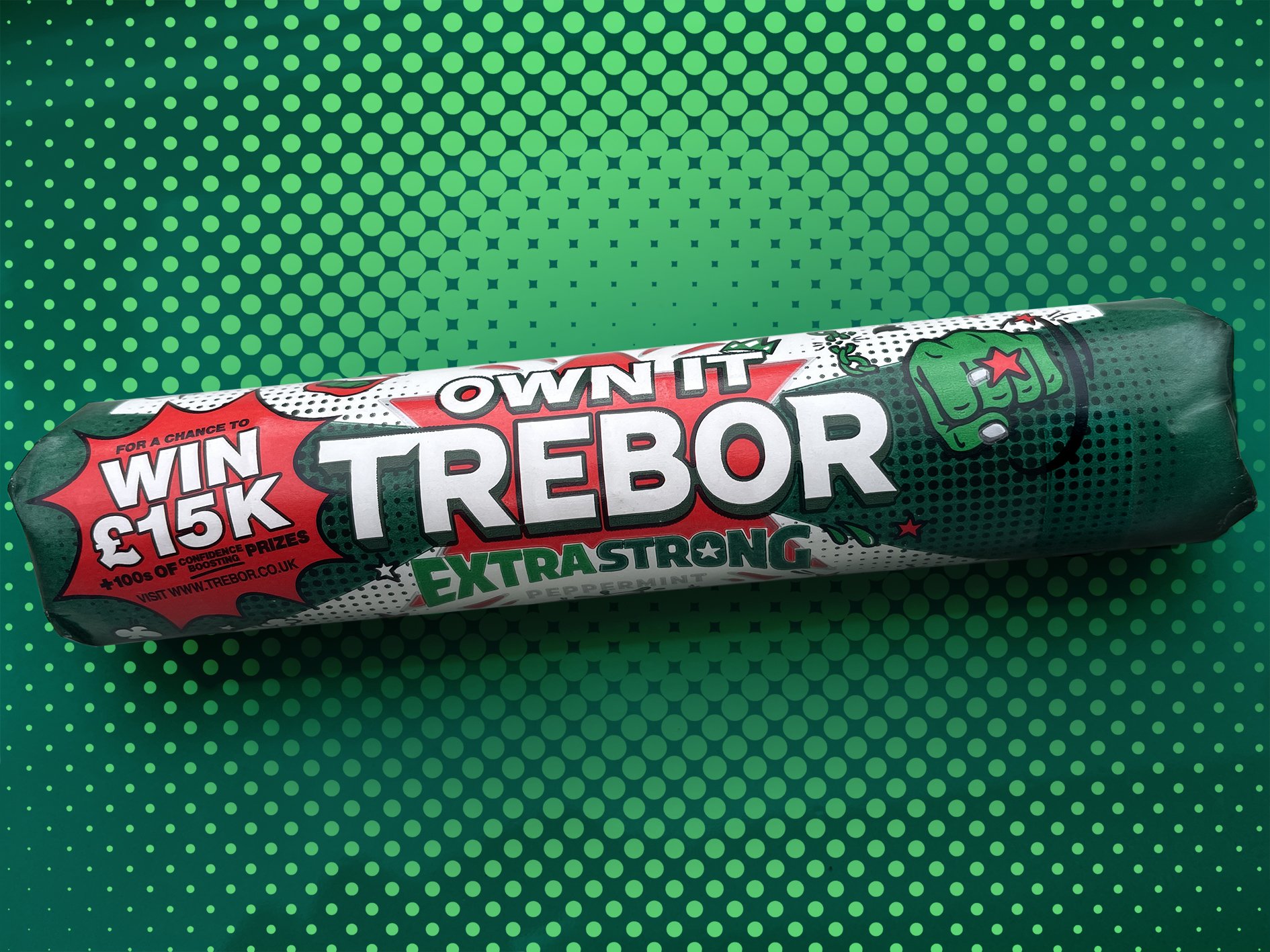
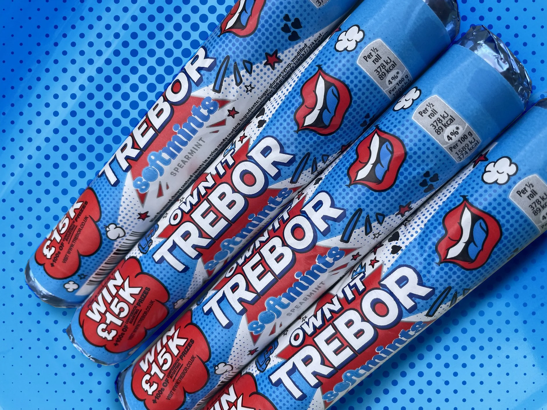
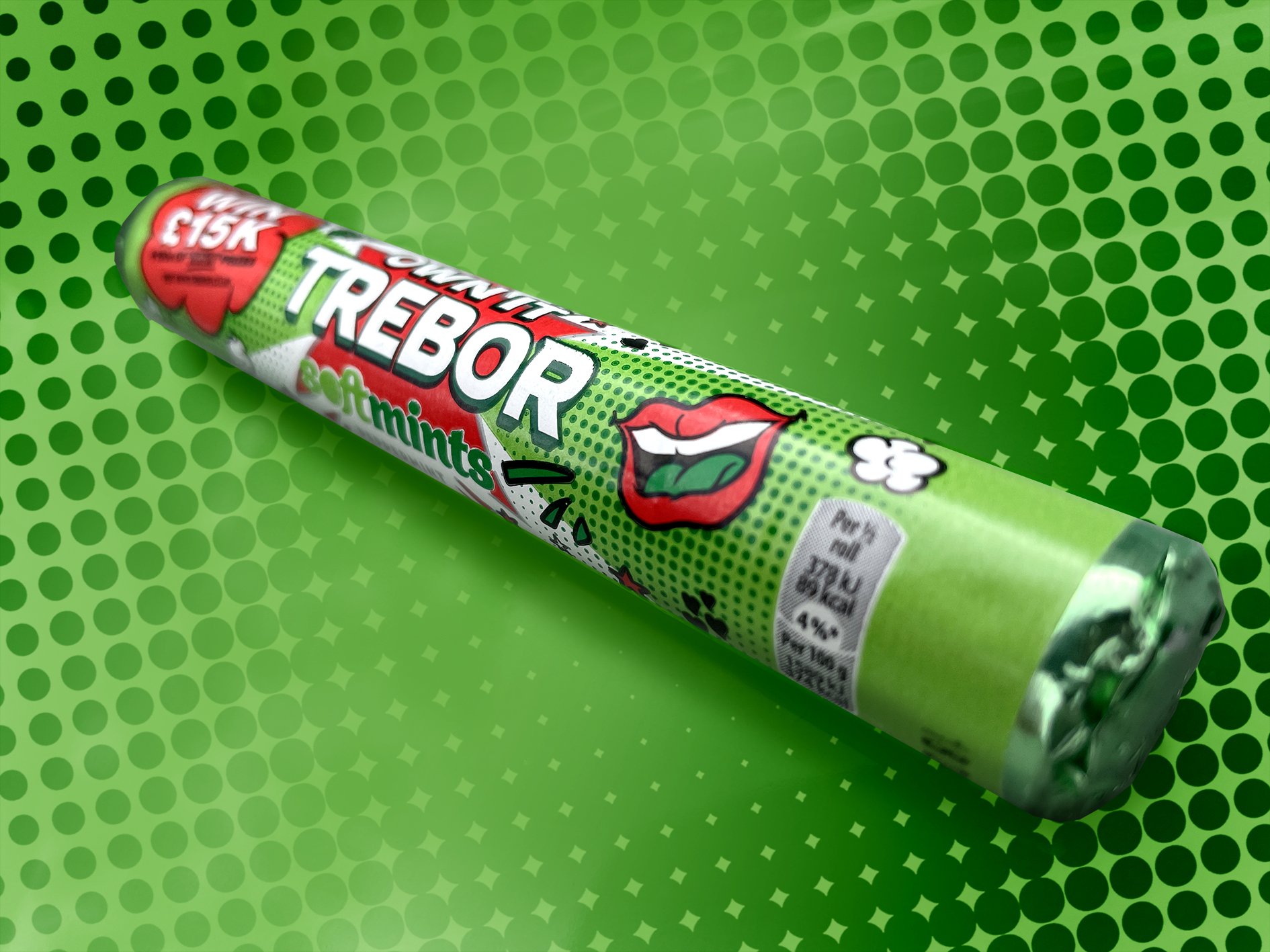
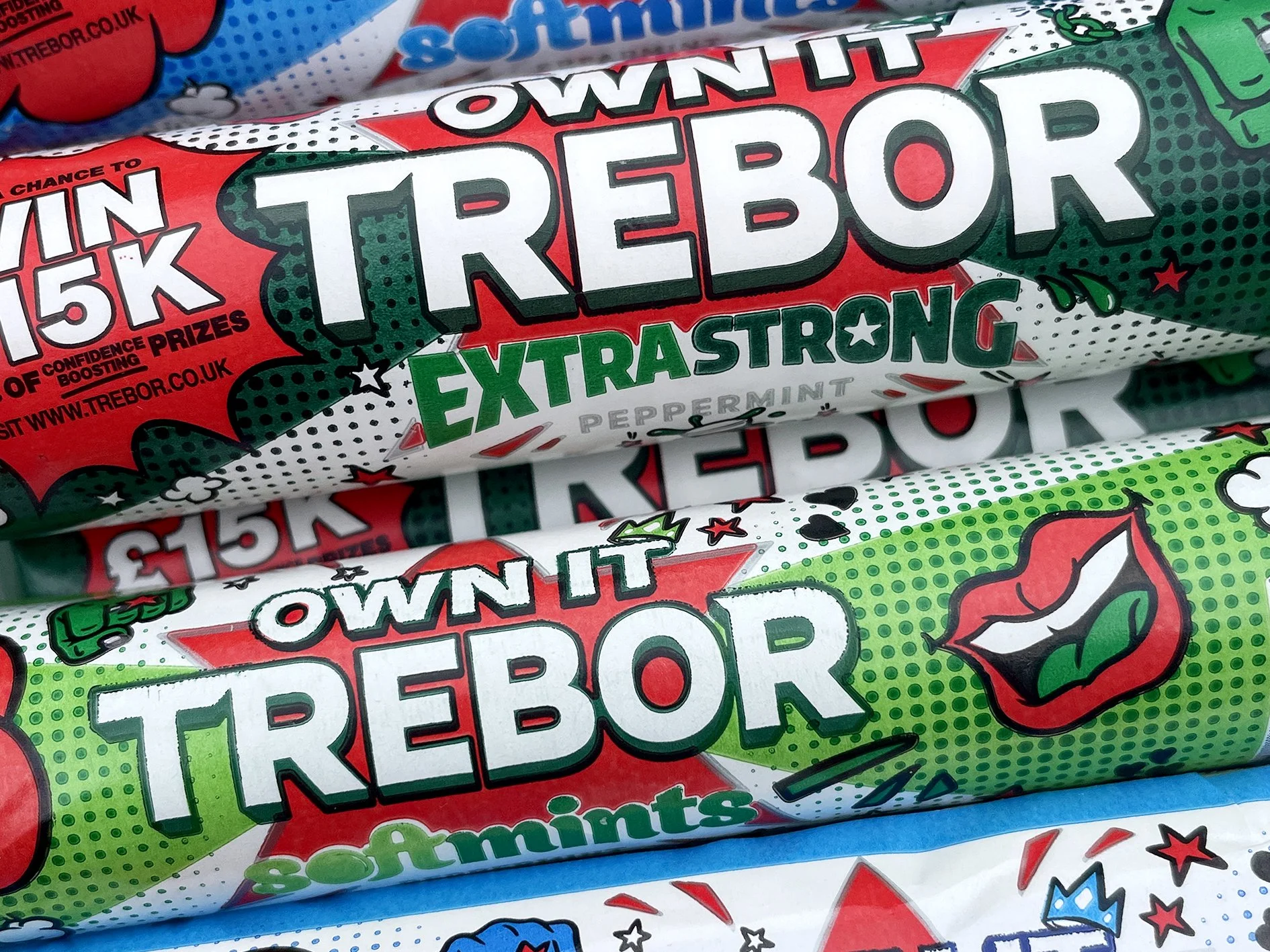
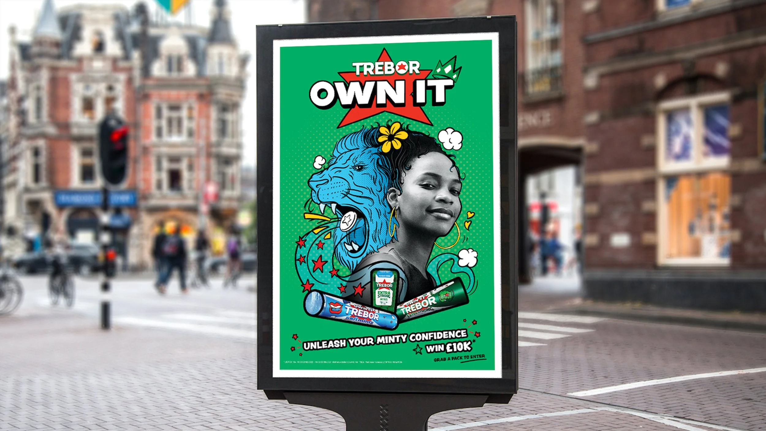
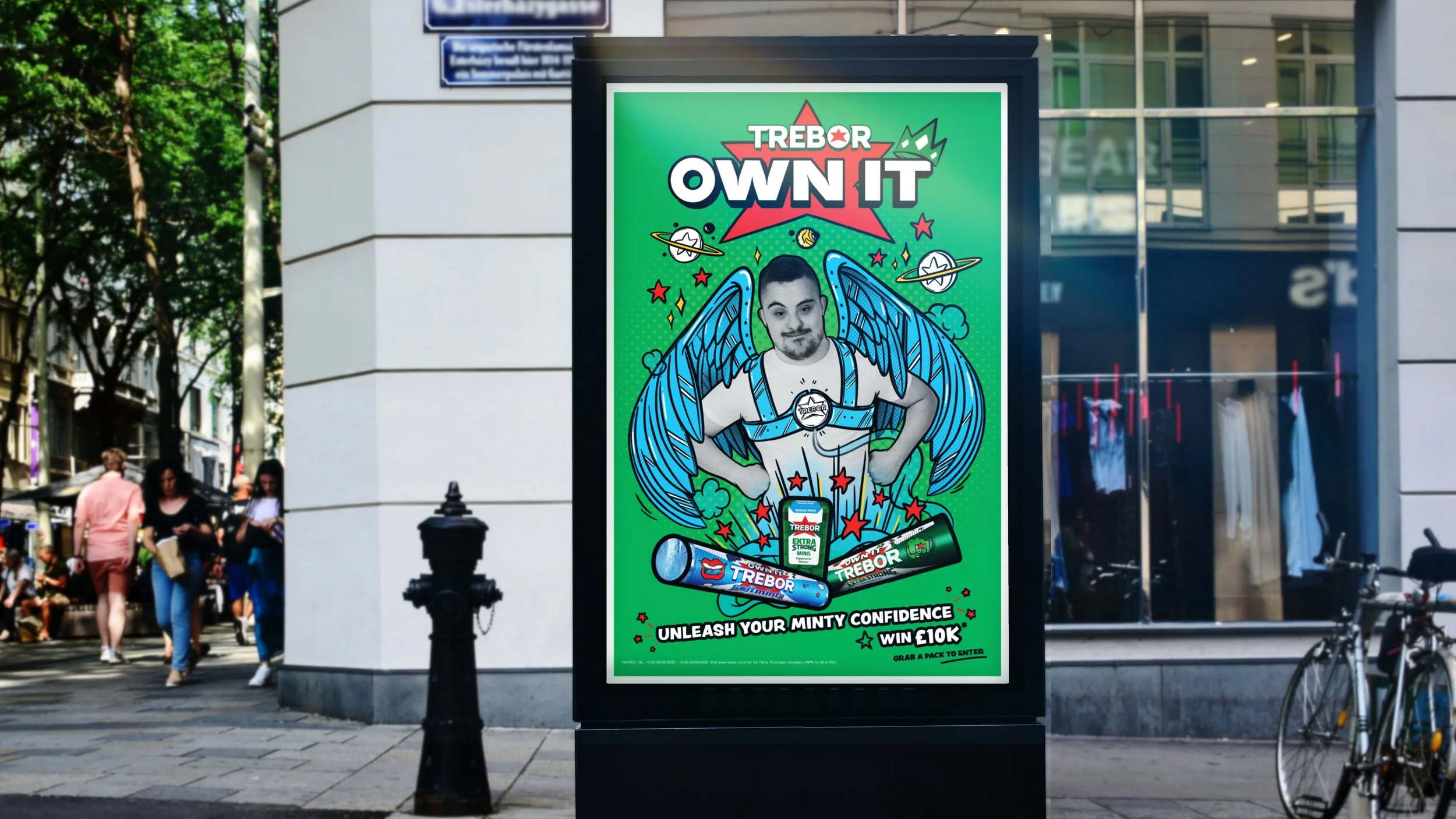
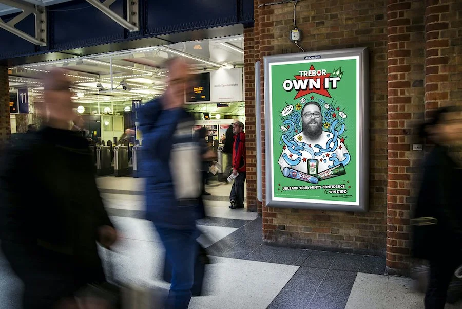
Pack redesign / OOH
Trebor had always been about physical strength. We moved it to inner confidence.
Trebor was seen as stuffy and irrelevant to anyone under thirty. The strategy was straightforward — the mintiest mint gives you the boldest hit of confidence. OWN IT.
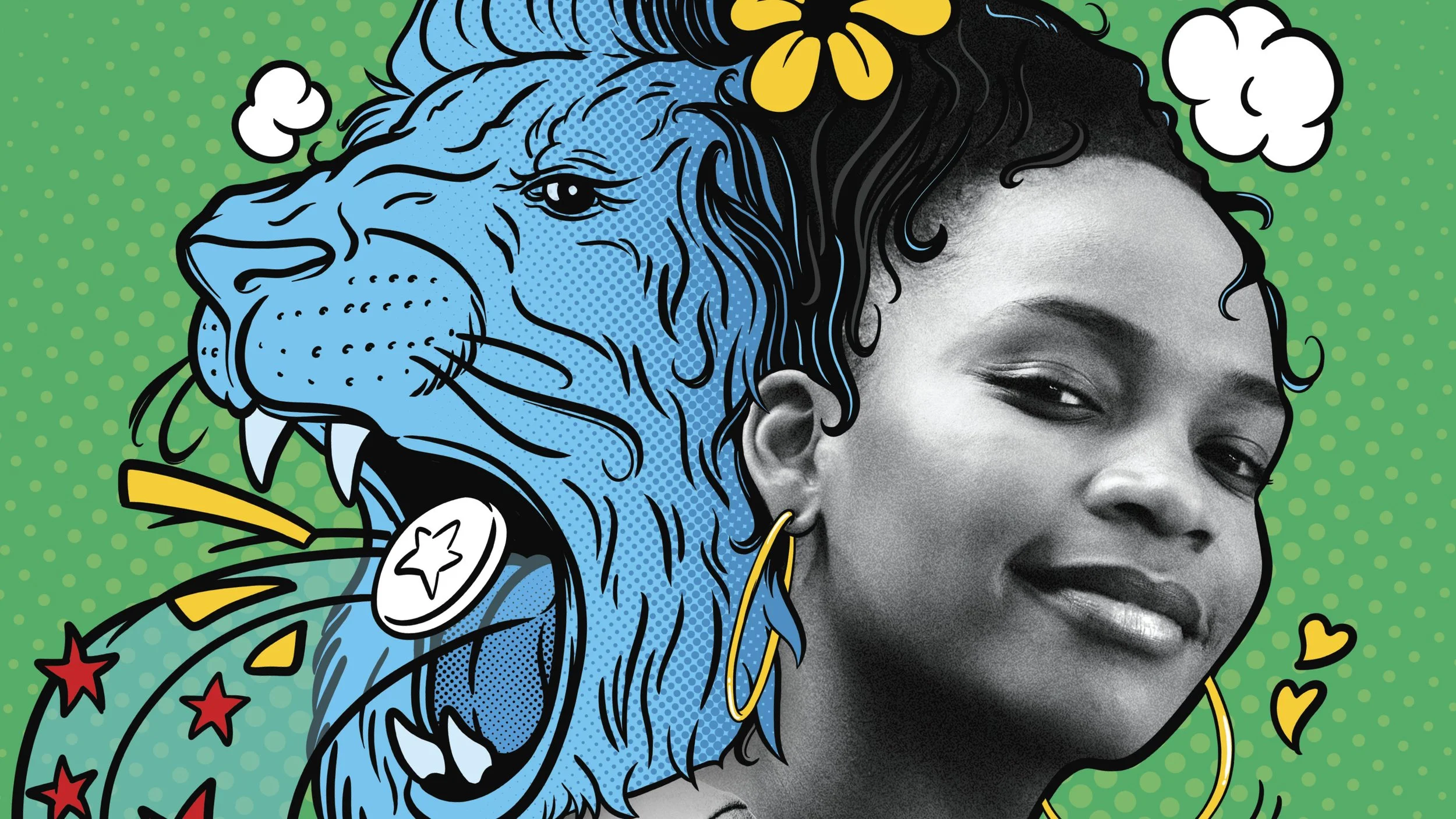
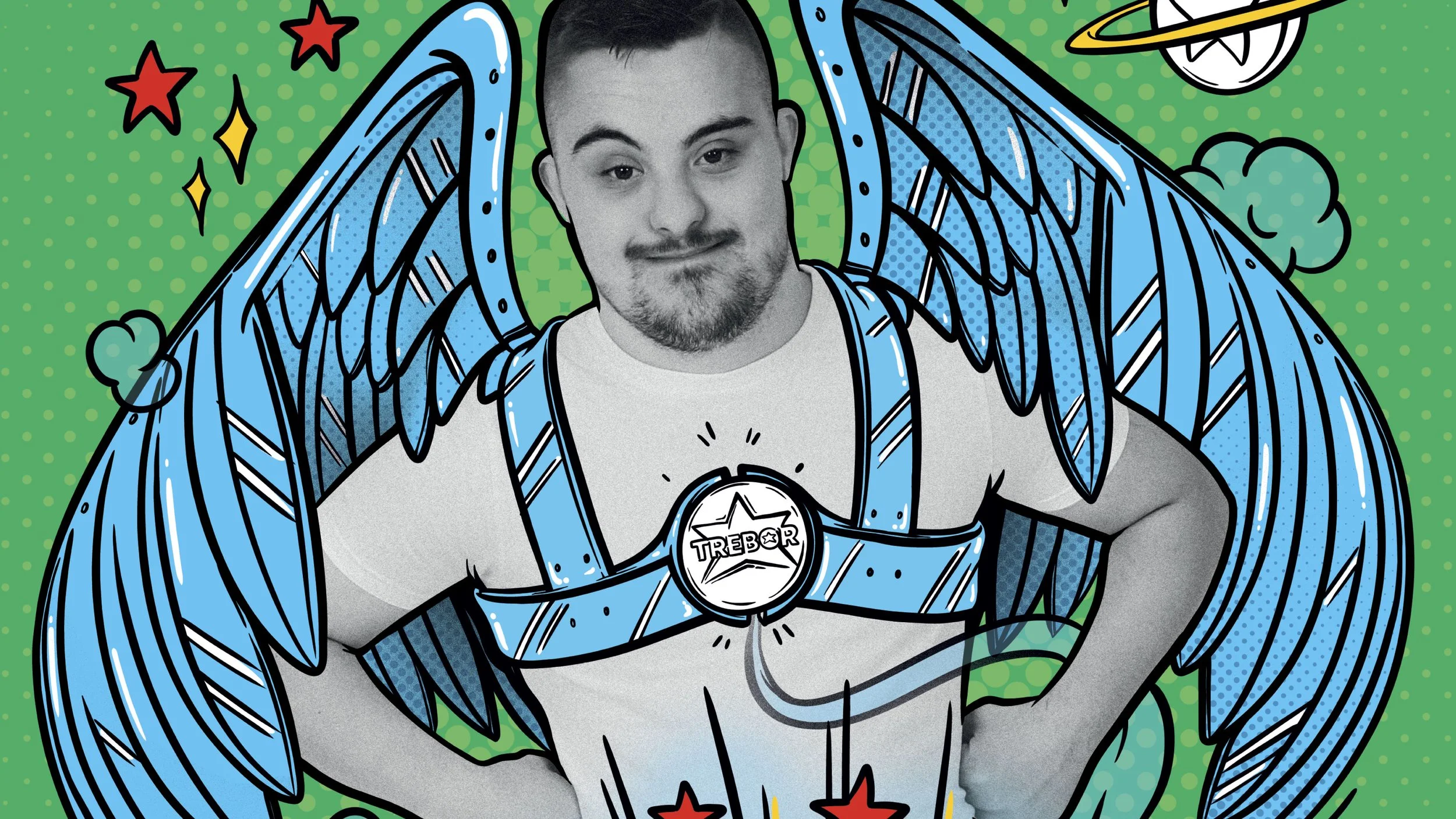
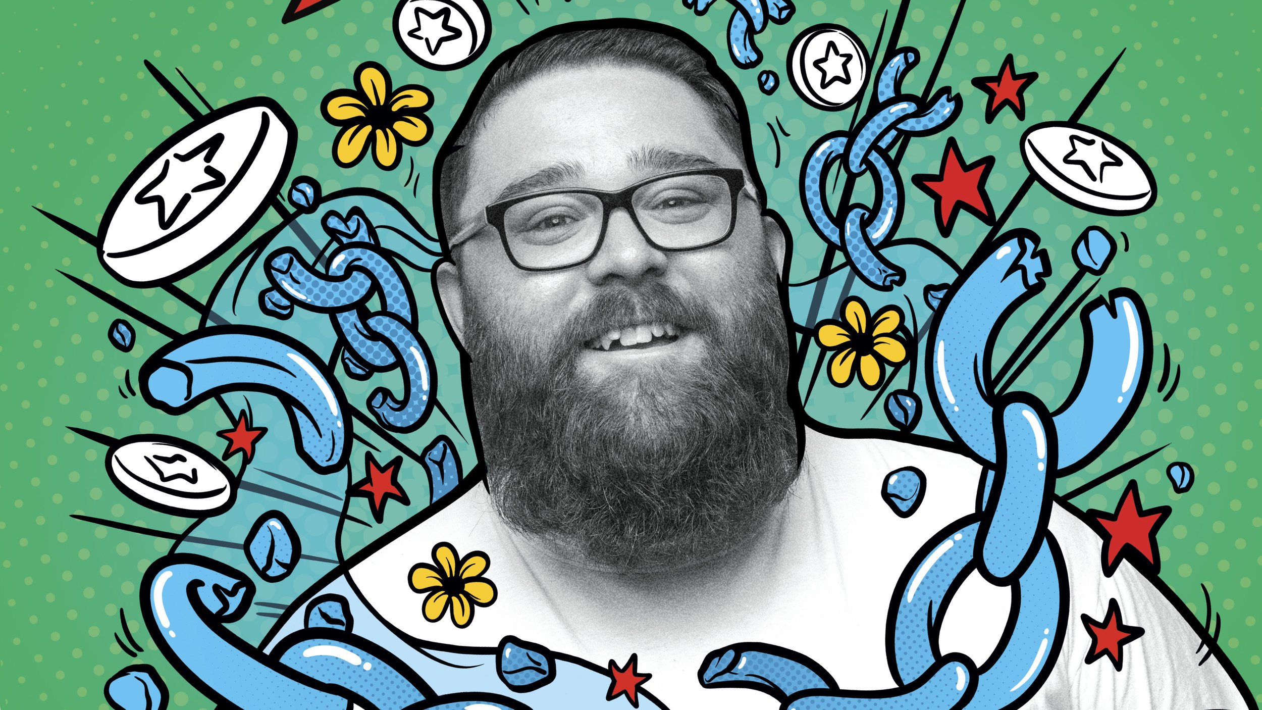
We brought in a young Polish illustrator with a powerful and playful style to build a visual identity around what OWN IT feels like. Bold power graphics. Fists, shooting stars, graphic energy. Then we redesigned the actual packs — the first time Trebor had let anyone scribble over their real estate.
We unleashed the campaign to the streets with real people from all walks of life, illustrated over to show how each of them owns it.
What started as a campaign became a brand platform.
/ Punchy pack redesign
/ Became a brand platform going forward